Infographics are visual representations of information, data, or knowledge that are intended to present complex information quickly and clearly. They are created by hand, and revisions can take time. Infographics are useful for information sharing because they can improve cognition (understanding and perception) by incorporating eye-catching design elements and concise language to improve the human visual system’s ability to see patterns and trends.
Because their design packages content into visually appealing, consumable chunks, infographics tell a data story and stimulate conversation around that story. By sharing infographics on a website, including them in a newsletter, or posting them on social media platforms, you can reach a larger audience.
Why Should Quality Professionals Use Infographics?
What activity do you spend the majority of your day doing as a quality professional?
Of course, communication is the answer. Every Quality professional is a member of a Project team that spends 90% of their time communicating with stakeholders to ensure that your ideas and thoughts stand out. And, in order to accomplish this, the ideas and concepts must be properly packaged so that nothing is lost in translation.
Quality professionals communicate and deal with information in some way –
Encouraging or explaining outcomes
Analyzing data in greater depth
Making a name for yourself as a thought leader
Stakeholder Education
The following factors are important to a Quality professional in determining project success:
Brevity – The communication package should help stakeholders quickly understand the Problem Statement Decision – Increased awareness leads to faster decision making, which leads to project success.
Engagement – Data visualization aids in the telling of a story, which inspires actions and draws interest across the project team, resulting in team buy-in, problem-solving, brainstorming, and so on. These are the primary characteristics of infographics.
Quality Professionals understand what the data means, so they should be able to assist in unpacking the meaningful data story (amid a large amount of data) and be a part of the audience mapping to ensure the design has the appropriate level of technical depth for the target audience.
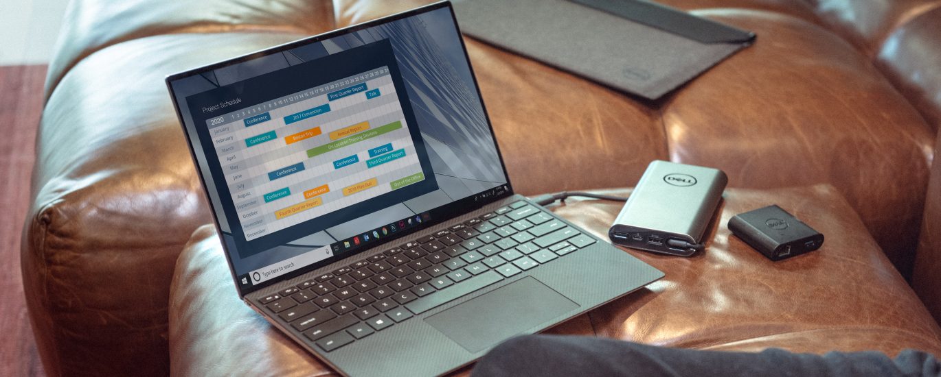
Seasoned quality professionals display information and communicate using infographics and charts such as the box plot, histogram, line graph, bar graph, and more, which are in their raw form but can be transformed into a huge self-branding factor by using icons, symbols, colors, and selecting the right infographic template.
1. Infographic Project Charter – Business Case Exemplification
A Project Charter is a document that authorizes the Project Manager to use the organization’s resources for the project, and the project cannot move forward unless the project charter is approved.
You work as a Six Sigma Blackbelt for XYZ Pvt Ltd, a multinational manufacturing company. Despite the fact that you have only been with the company for three months, you have evaluated the entire value chain and identified key problem areas, most notably the customer drop-off rate, which has risen to 50% in recent months.
You managed to gather accurate data on the subject with great difficulty, and you want to start a process improvement project as soon as possible, for which you need to create a Project Chart and get the approval of 12 stakeholders spread across locations and departments. You also learned that the stakeholders are extremely busy, and their email response rate is poor. Getting all stakeholders on the same page is nearly impossible due to the lack of available slots, time-zone differences, and the approvers’ lack of understanding of processes outside their department. The only option left to you is to publish an engaging project charter that will pique their interest.
Steps – Create COPIS Customer – They are the project charter approvers.
Output – An engaging project charter that will assist approvers in understanding the immediate need to begin the project.
Business Case, Problem, Scope, Approver’s List, and Milestones will be shared.
Fear is the emotion that will be delivered.
Color – The colors used in the company’s logo.
Visualized – Theme Article
Contribution – Business Case
-When did the company begin?
-What is the product manufactured by this plant?
-How much does this plant contribute to the overall revenue of the organization?
-How many additional manufacturing plants do we have?
-How many operators are there at this plant?
Problem Statement -The operator’s efficiency has dropped from 95 percent to 80 percent.
-Efficiency reduction has resulted in a delay in on-time delivery, and every customer has requested an escalation.
–
In the last three months, half of our customers have switched to a new supplier.
Project Goal -In three months, increase the customer satisfaction score from 0 to 75%.
-In three months, increase customer retention by 50%.
-Shorten the cycle time.
-Recalibrate the equipment to avoid errors and rework.
-Reinforce the Operators.
Milestone: Finish the project in three months.
Source -The data was gathered from the operators, a customer survey, and the company’s website.
Design – Plan the order in which you expect the reader to scroll through the content on the chosen template to maximize engagement. A project charter should start with a title, just like any other presentation, and then move on to the business case. If the receiver is already familiar with the business, he will proceed to the problem statement; if not, the business case will provide him with a brief overview of the company and the business and will engage them. Once the problem is understood, proceed to the scope, which discusses the areas we intend to address in order to solve the problem, and then to the goal statement with the milestone. They would have a clear understanding of the story by this point, and it would be appropriate to introduce the approvers.
Now that we’ve determined the order in which the information must flow, it’s time to begin putting the points under each section with as few words as possible and mapping an Infographic vector against each point.
Work on alignment and color schemes.
You may also include any additional information, such as constraints, high-level risks, assumptions, and so on, if you believe it is relevant.
Distribute the infographic to all relevant stakeholders and track participation and effectiveness.
2. Wedding Infographic Card
I’d like to ask you a question. What qualities do you look for in a presentation? Whether it’s a weekly performance report, a dashboard presented to a customer, or a new idea pitched to the leadership team, every presentation must meet a certain basic, common set of requirements. The answer may differ depending on the type of information we intend to provide, but what users remember is “how engaging was the presentation!”
A wedding card is one of the most boring presentations I’ve seen – the bride and groom would select a card from a variety of creative options, but they all end up looking the same. Every time I get a card, I look at the venue details, the date and time, and nothing else, and I also know where they are on the card. But a wedding card means a lot to the bride and groom, as I discovered at my wedding, and it was then that I got my first taste of Infographics.
In 2013, I was getting married to a Japanese national, and we planned to use infographics to create a wedding card to send to my friends and family. Before designing the card, I created a simple Quality Function Deployment to determine what would engage my audience. I brainstormed customer requirements and designed the card to include the following information:
Who is the lady?
Where did we first meet?
How did I persuade her parents?
How did she persuade my parents?
Wedding customs
What to look forward to at the wedding
What we intend to do in the future
I also wanted to include some charts and some humor on the card.
The goal was to put a genuine smile on the reader’s face, which we accomplished, and when I shared it on social media, I was blown away by the comments, with 90 percent declaring it to be the most creative card they had ever seen, with it receiving the most likes and engagement on Facebook of all my updates.